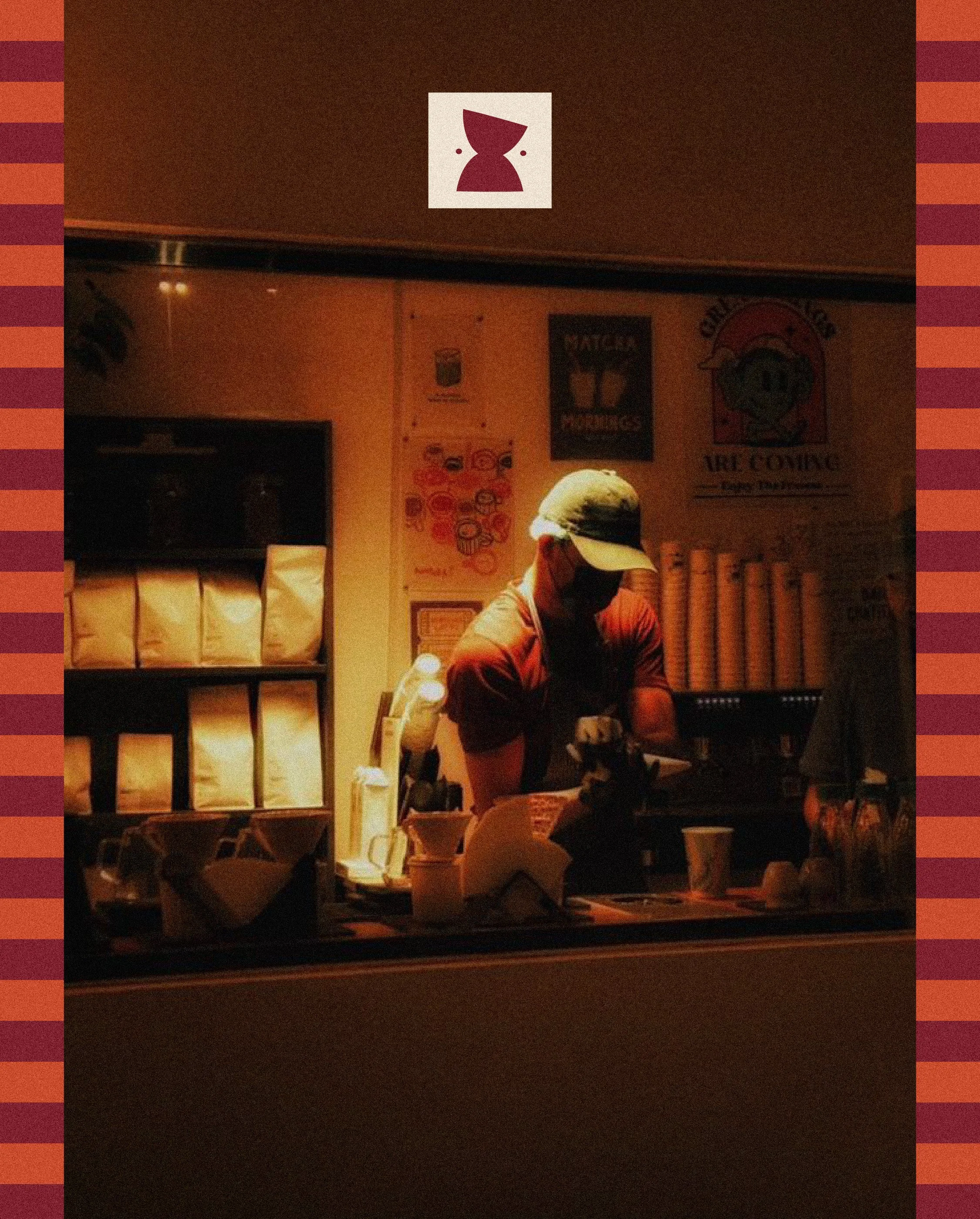
LITTLE GOOSE
Visual Identity, Packaging Design
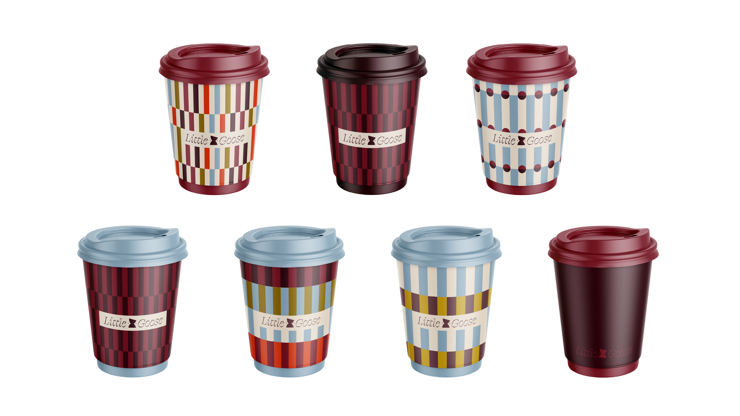
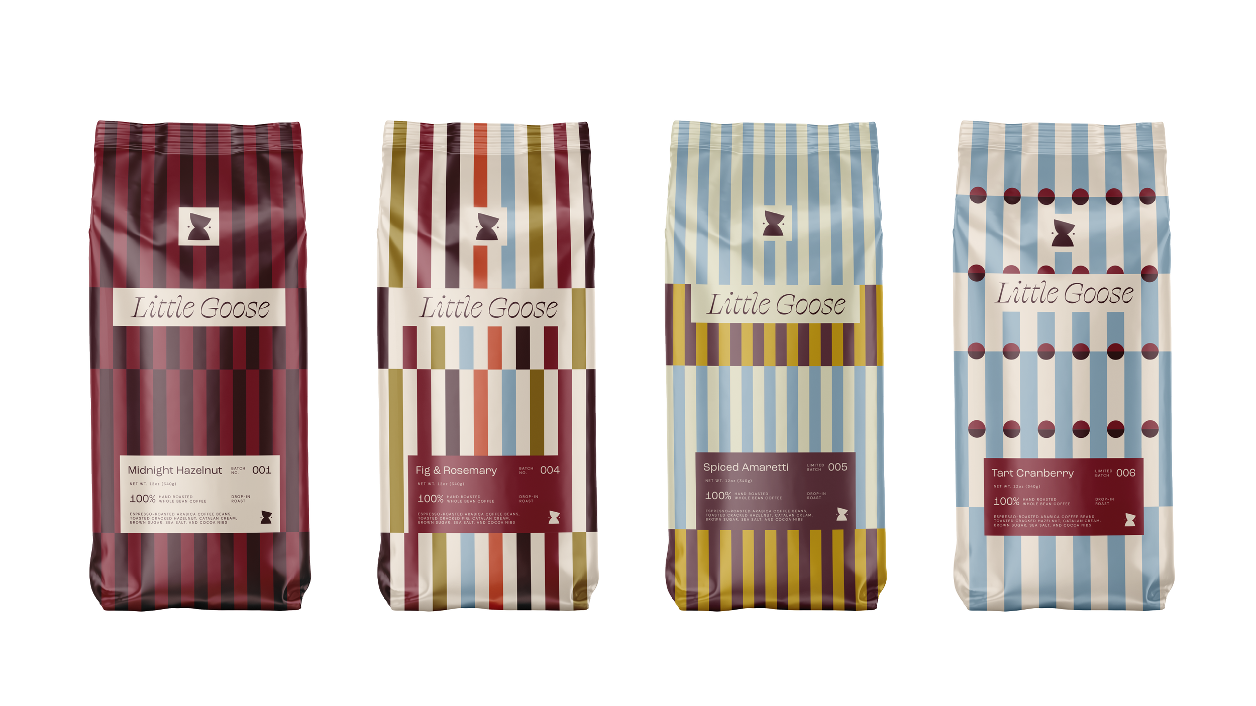
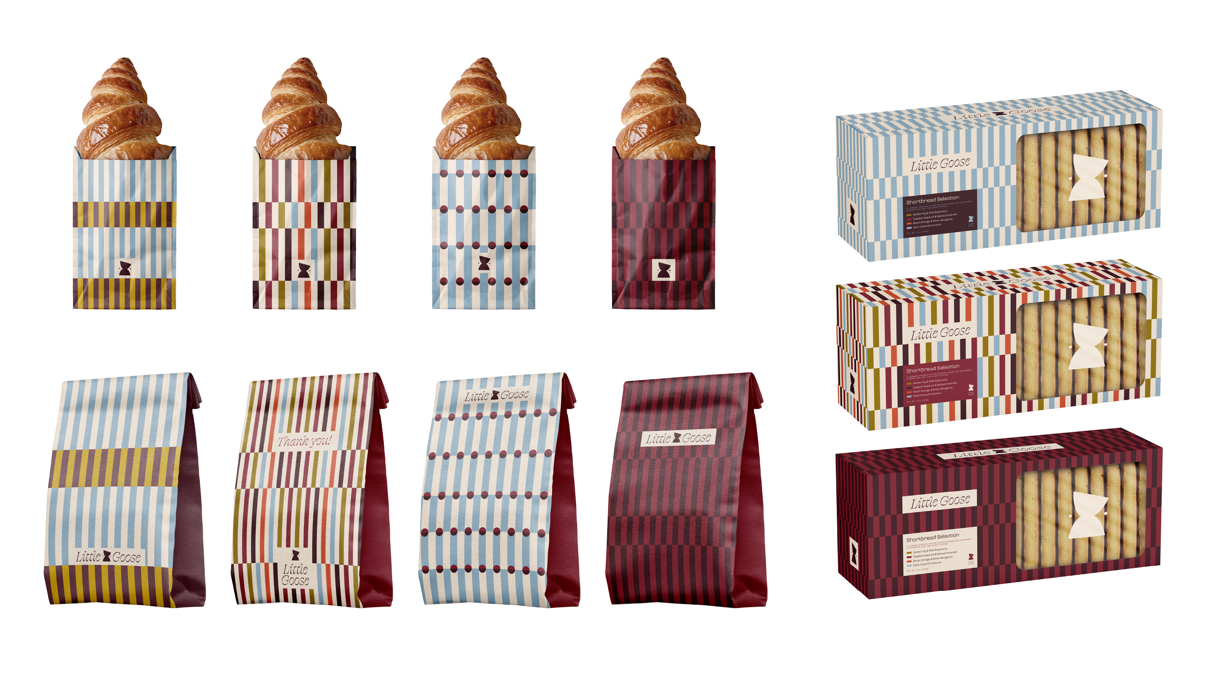
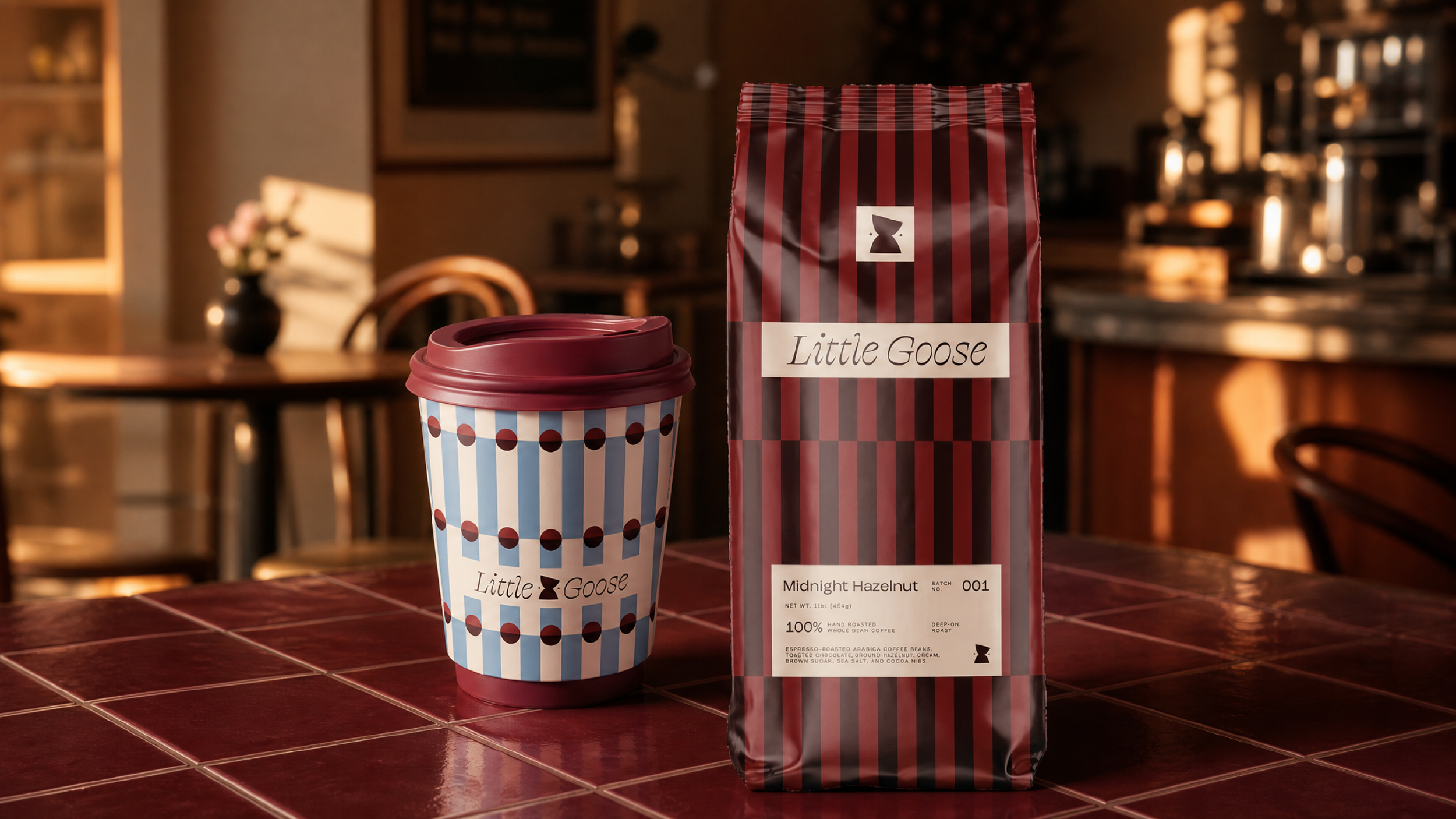
Rooted in the lingering ease of Italian café culture and postmodern aesthetics, Little Goose is a conceptual neue-café and third space designed for young creatives in fast-paced American cities looking for an intimate location to focus, unwind, or connect.
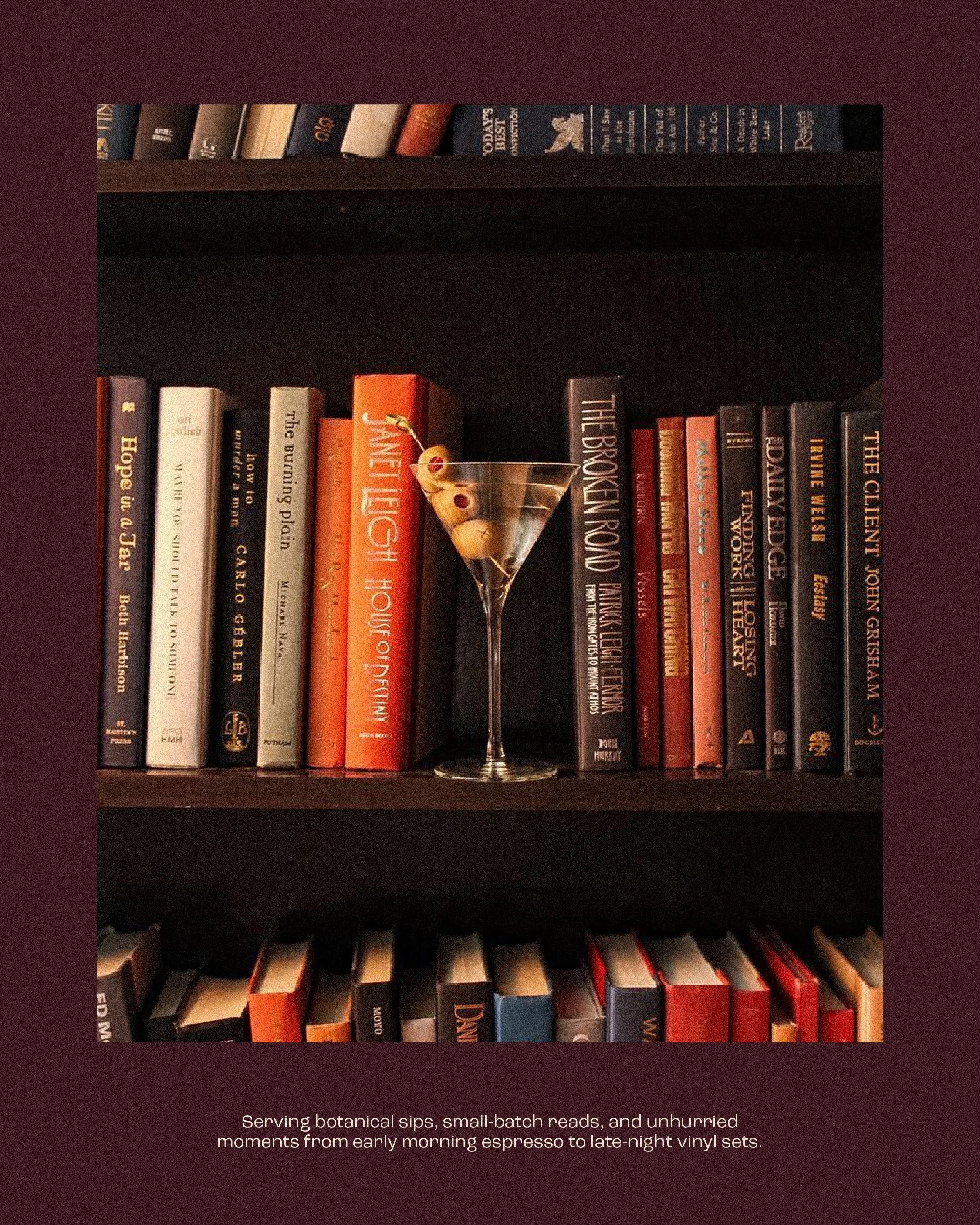
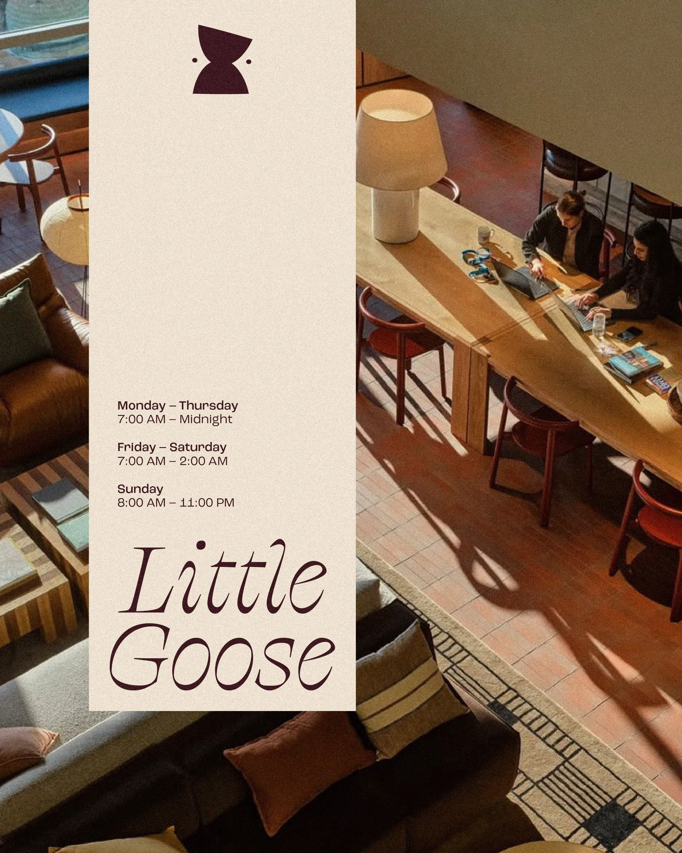
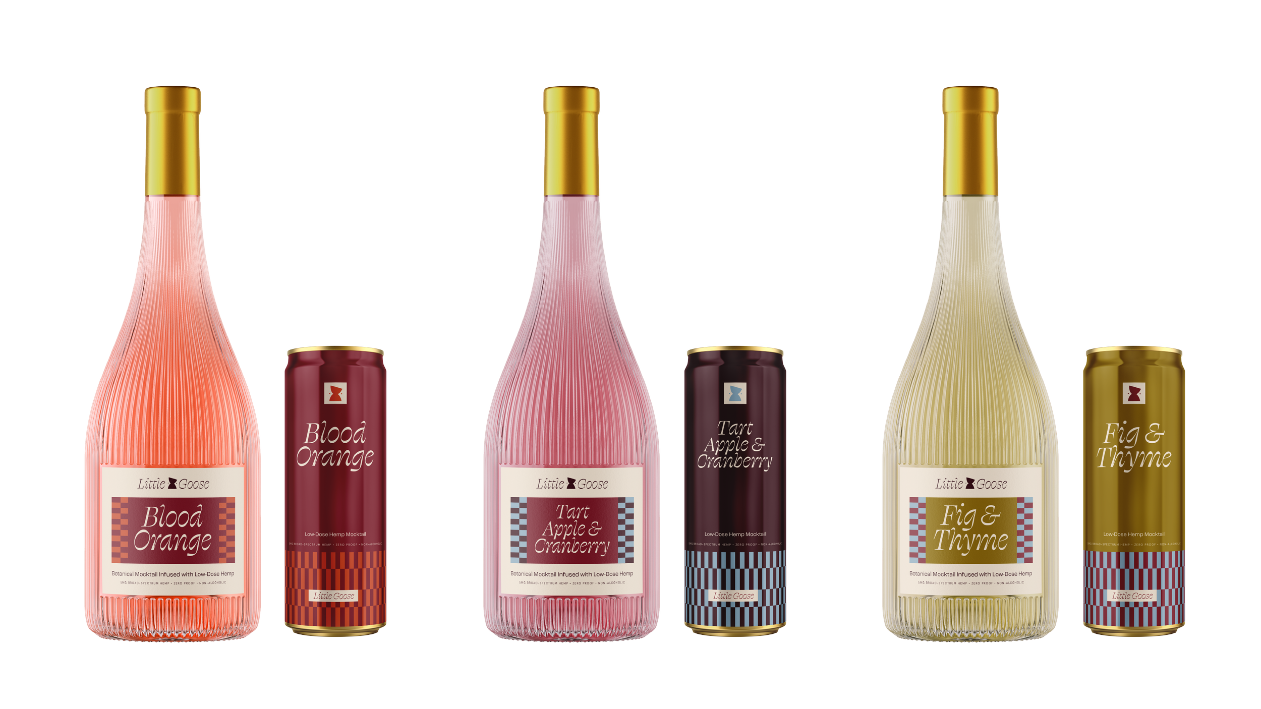
To encourage an unhurried environment, Little Goose operates with extended late-night hours, establishing a seamless transition from slow morning work into an intimate, story-driven evening salon. Addressing the cultural movement away from alcohol-centric nightlife, the space also decenters traditional drinking culture with a signature mocktail and espresso menu.
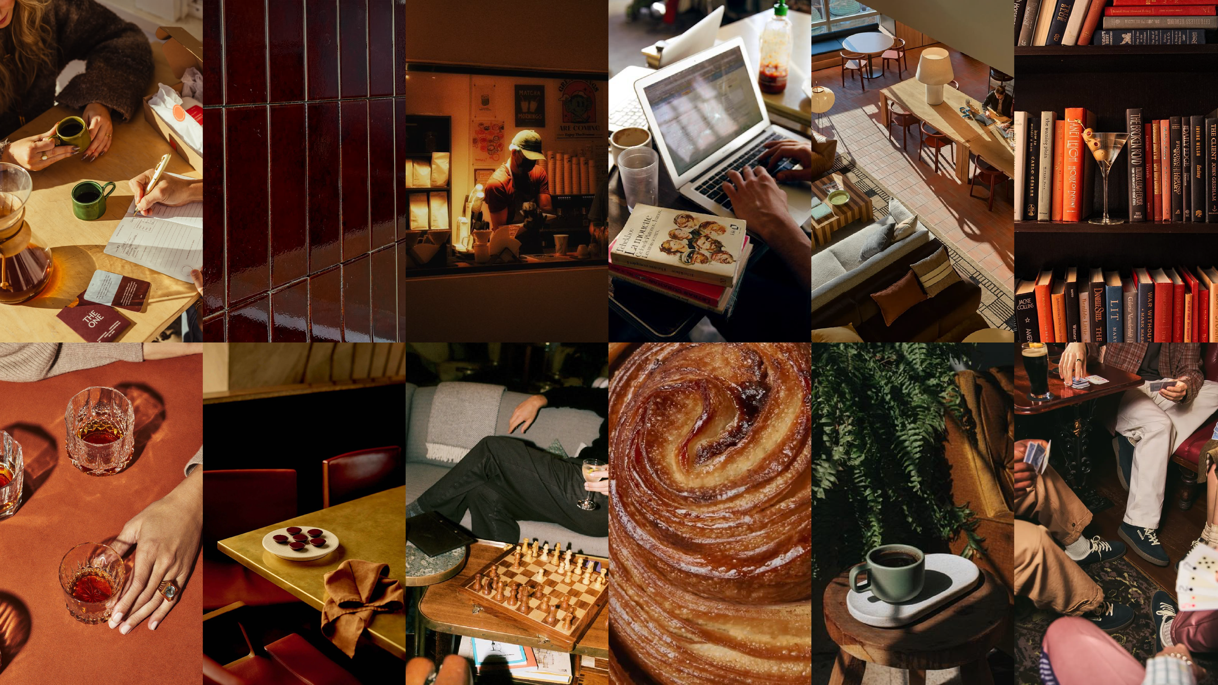
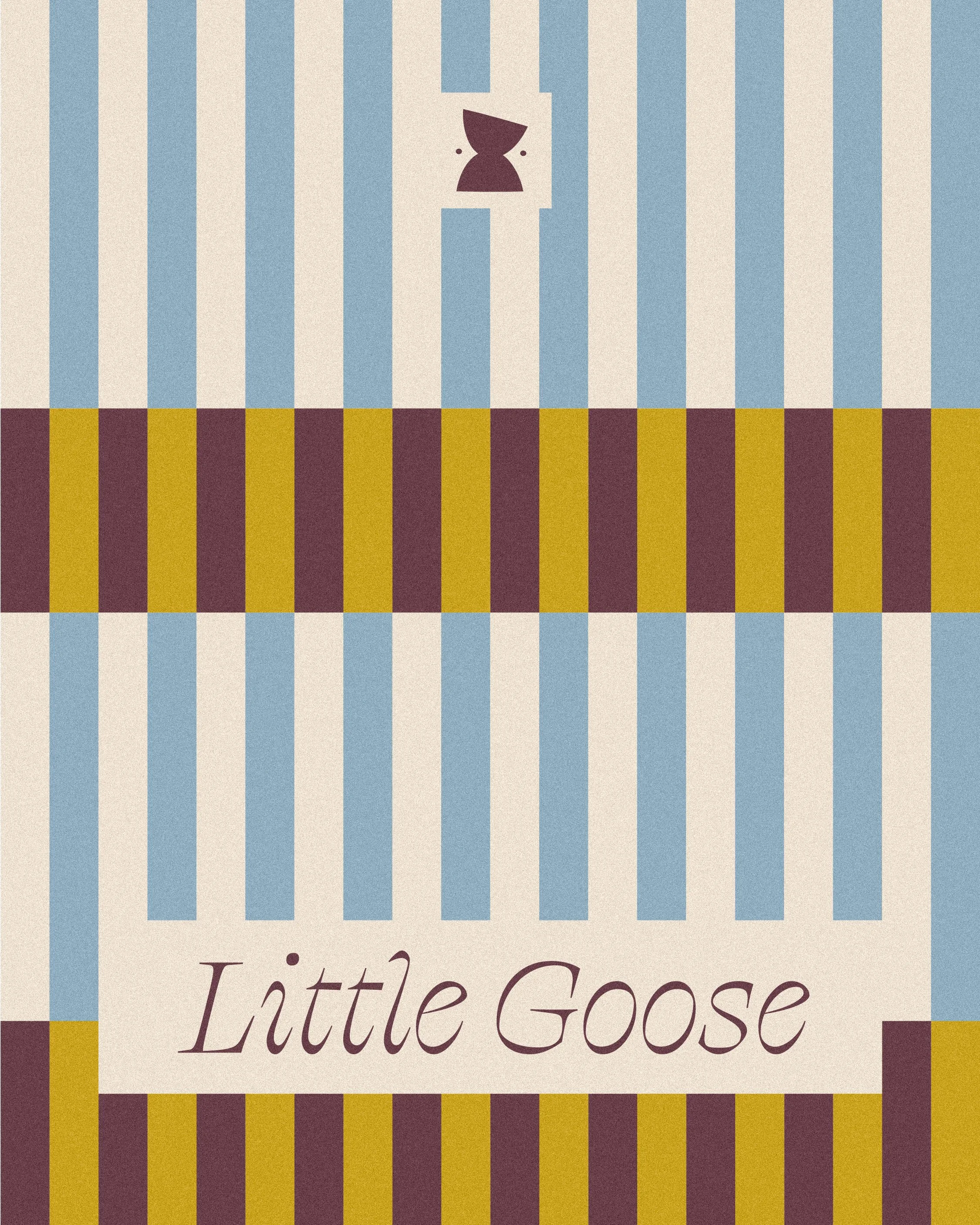
Drawing inspiration from the lingering hospitality of Roman osterie and traditional tile work, the art direction blends low parchment lighting and tactile natural materials to cultivate an accessible yet cinematic sanctuary. The visual identity balances approachable, democratic warmth with design-forward intimacy, shifting from sunrise to sunset.








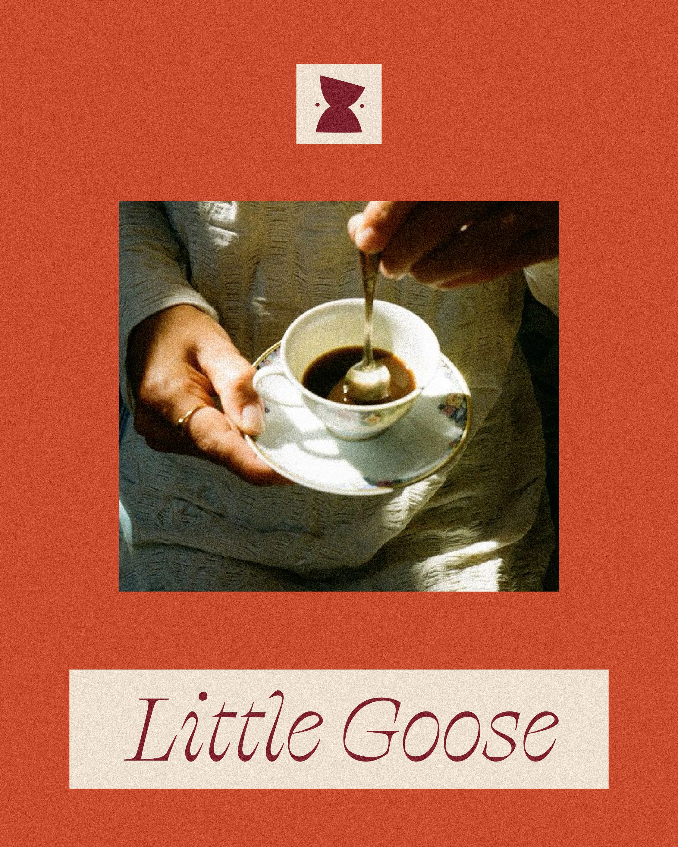
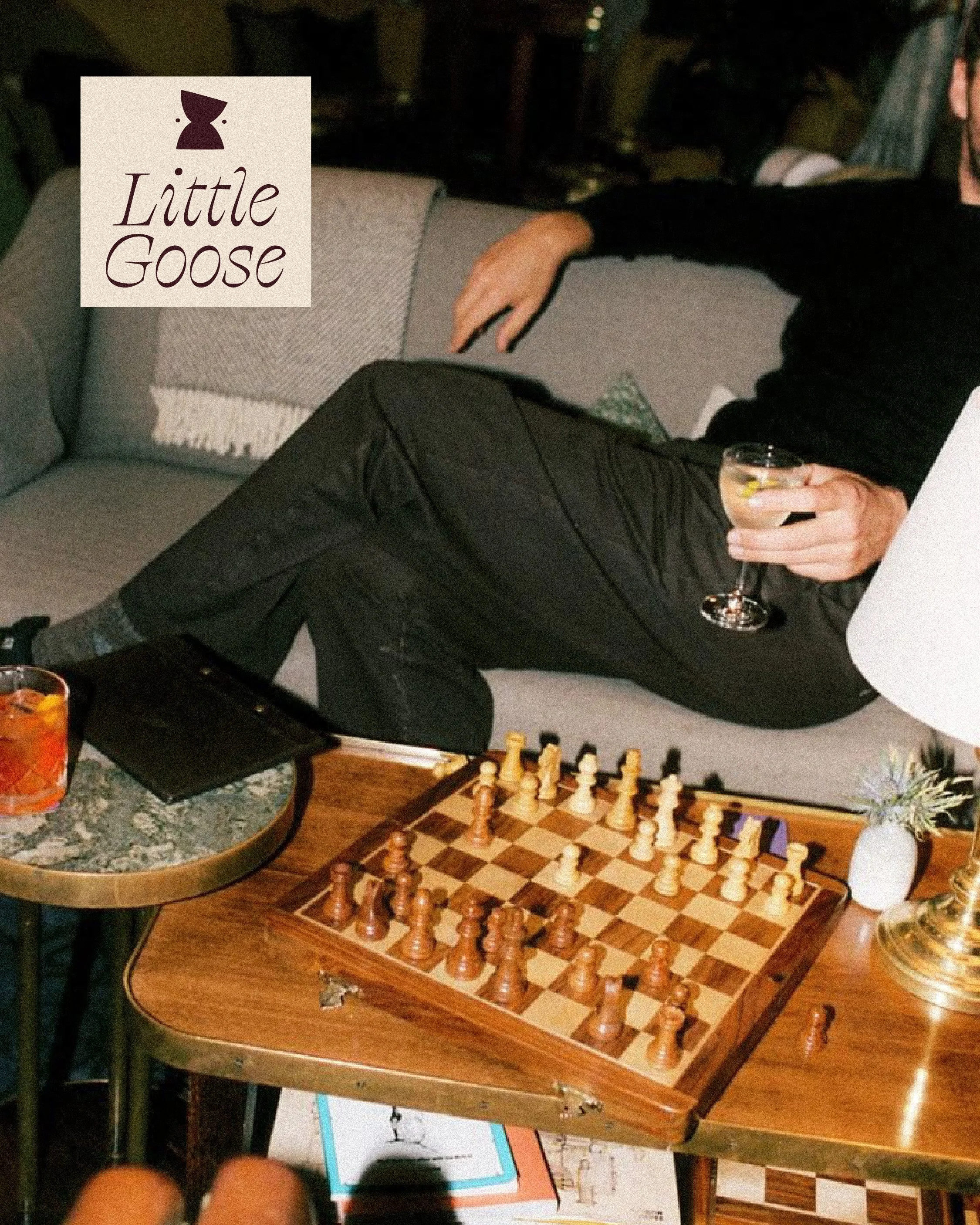
The mark merges a café cup with the subtle curve of a bird's beak within the negative space. A gentle tilt brings a touch of warmth and playfulness to the form.
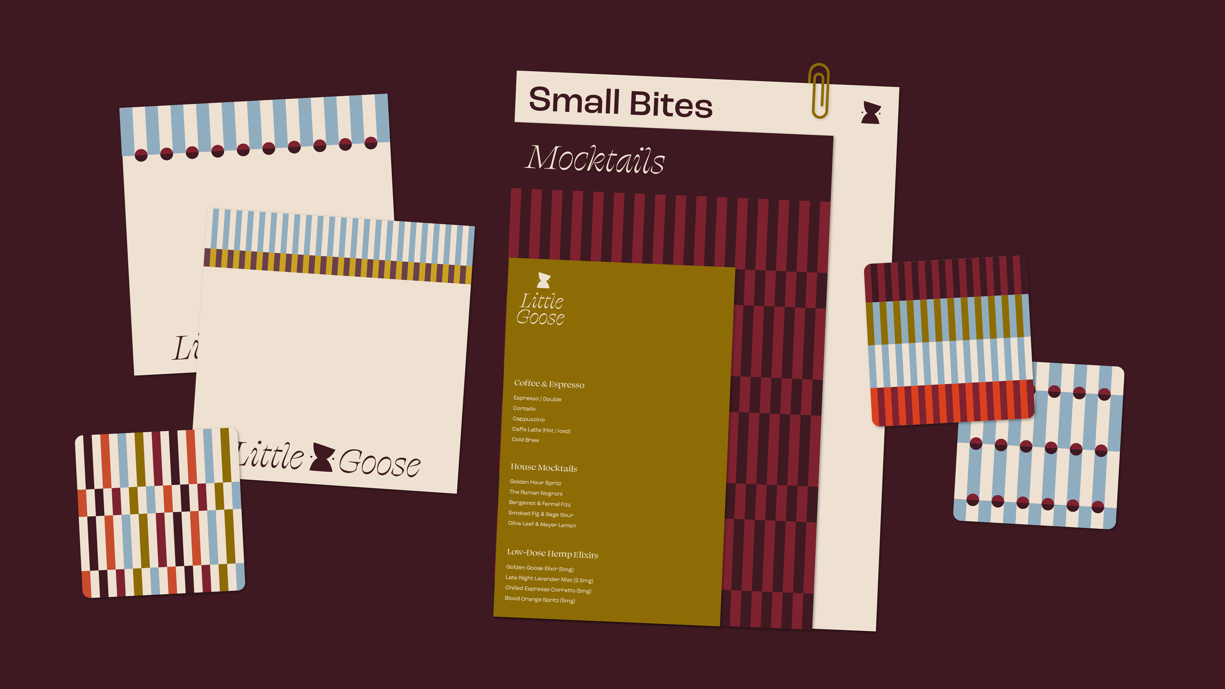
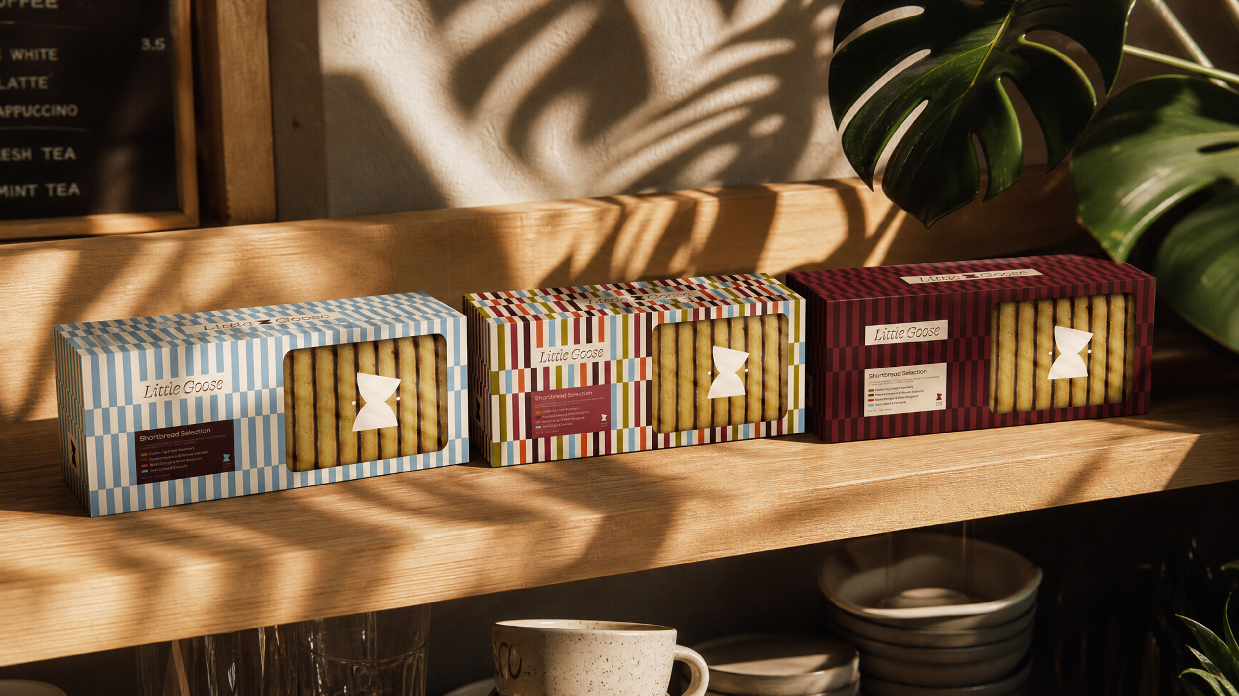


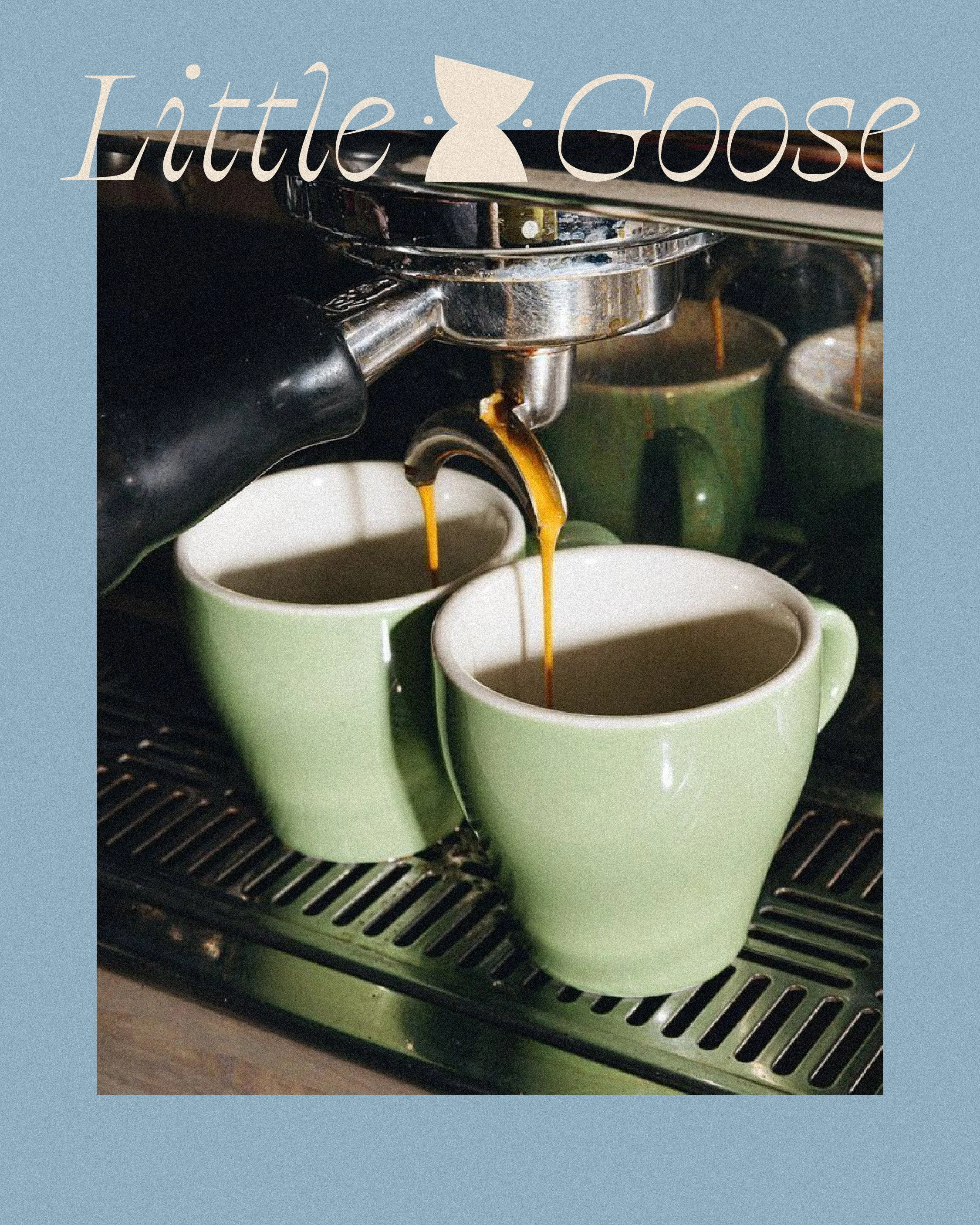
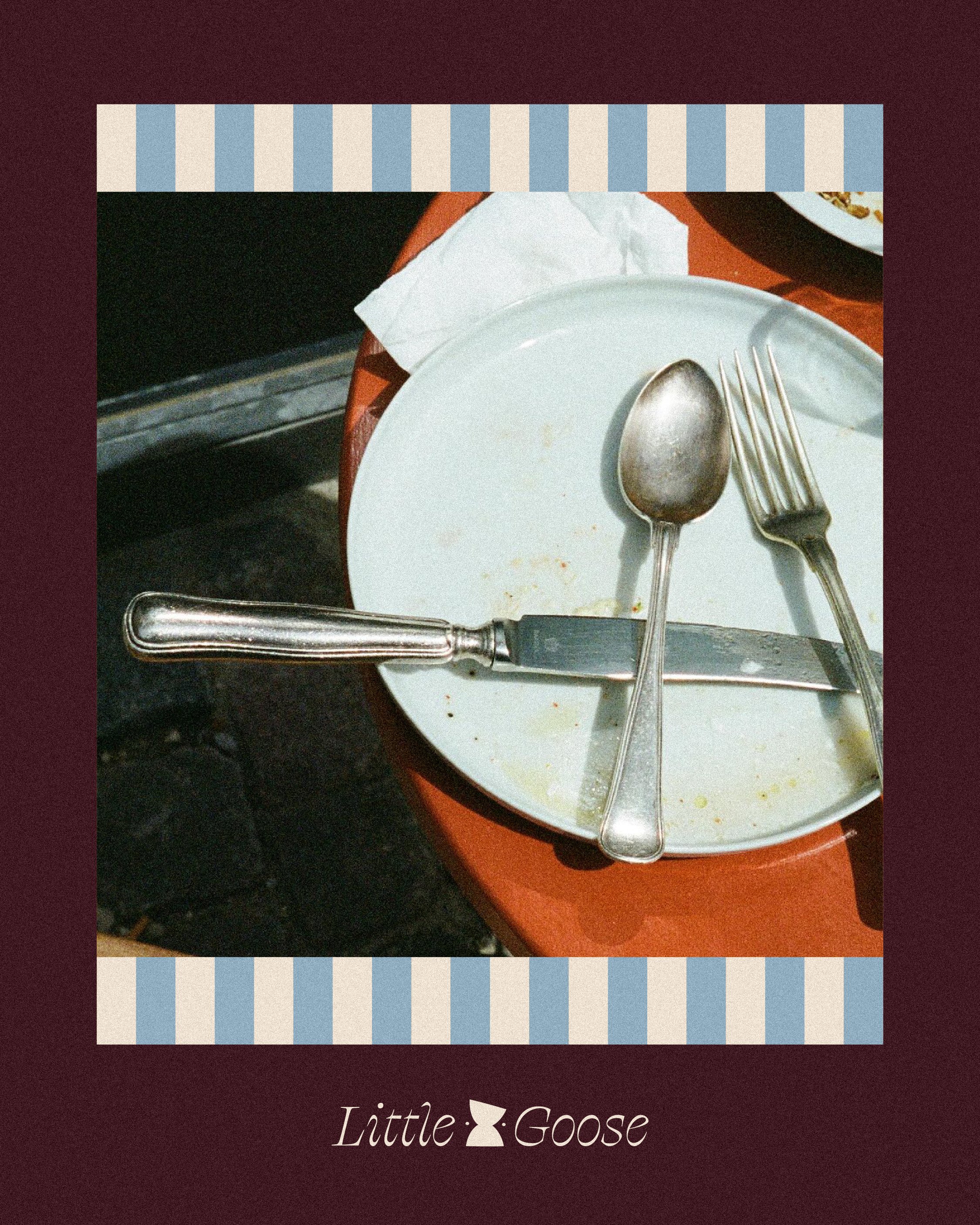
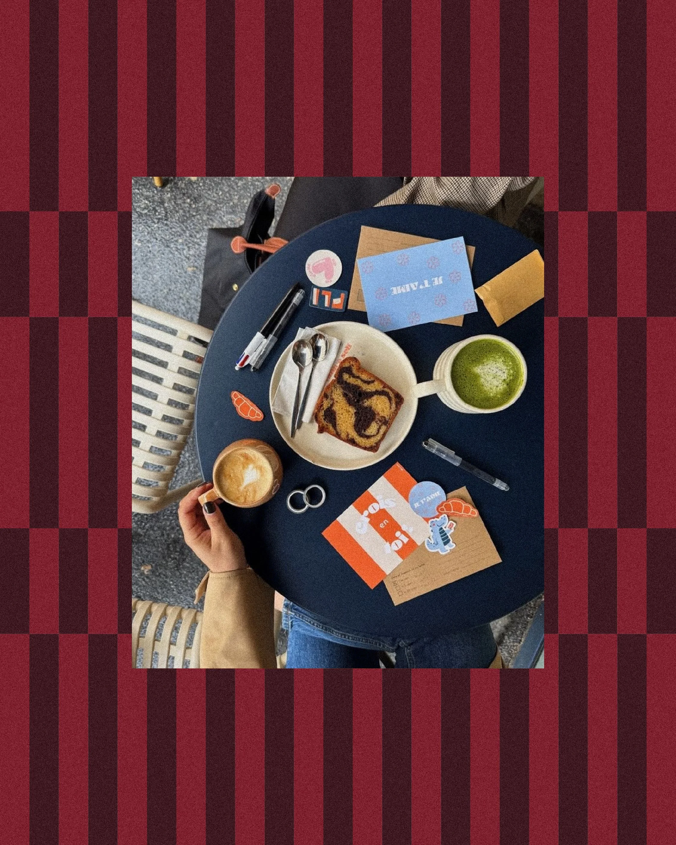
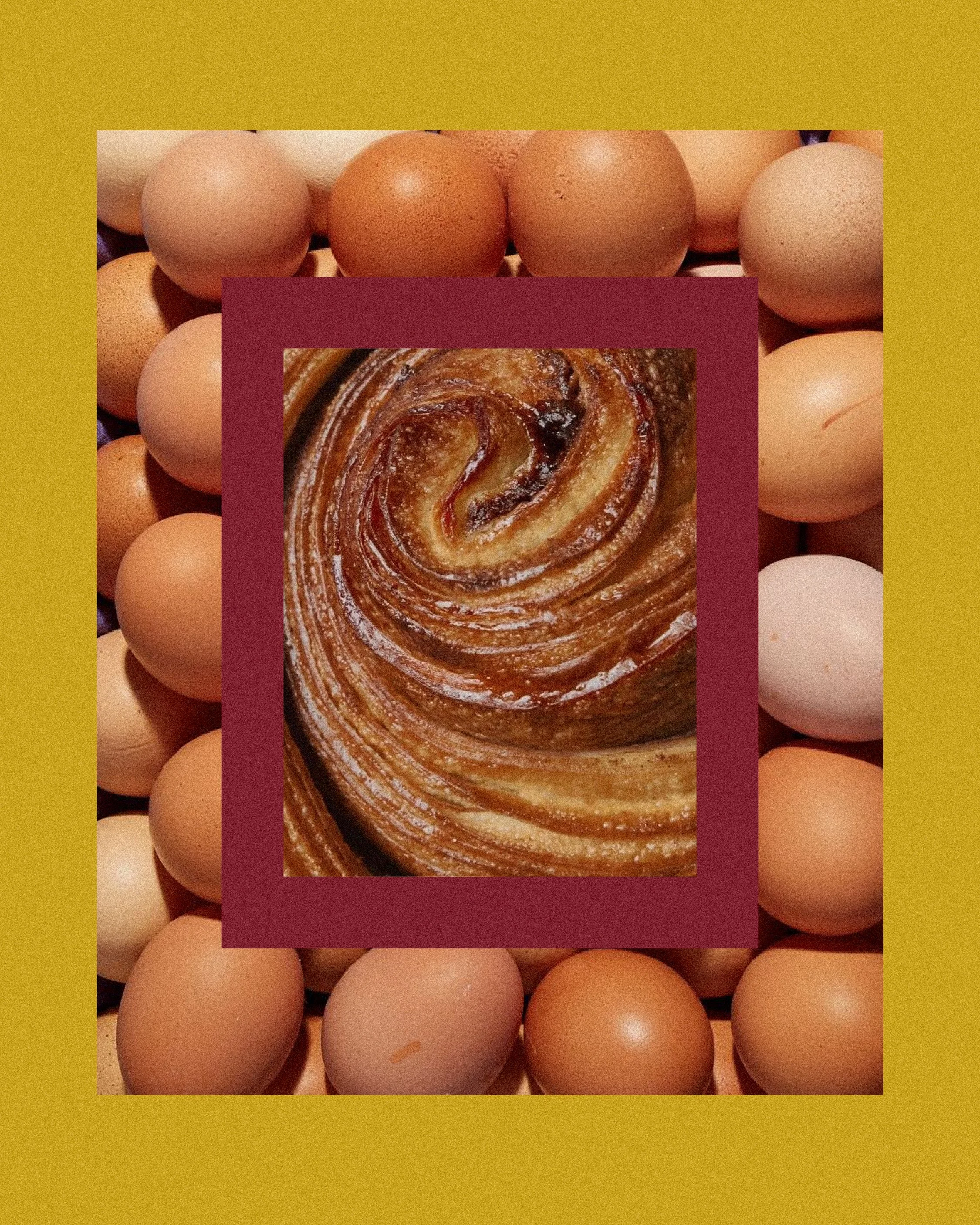
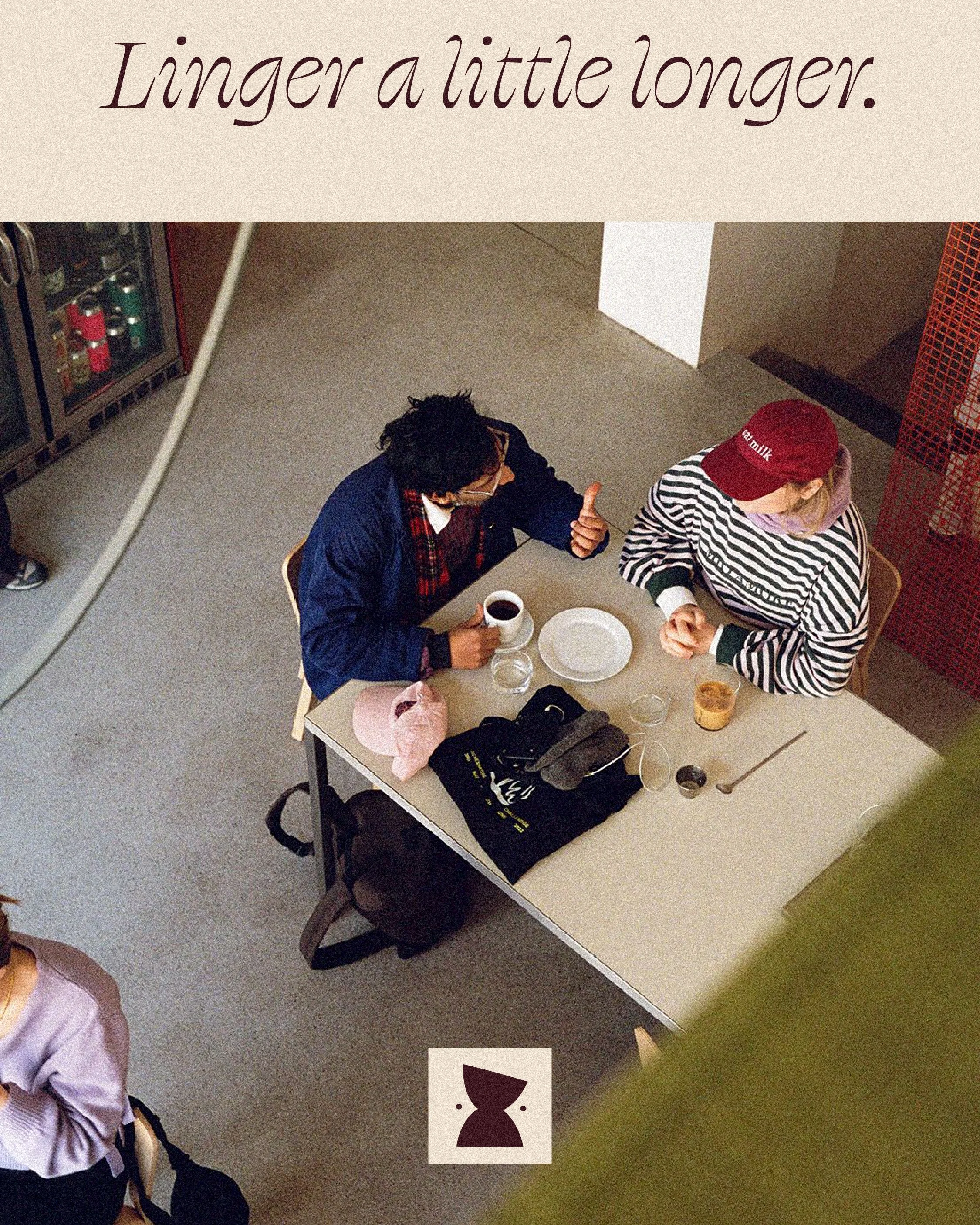
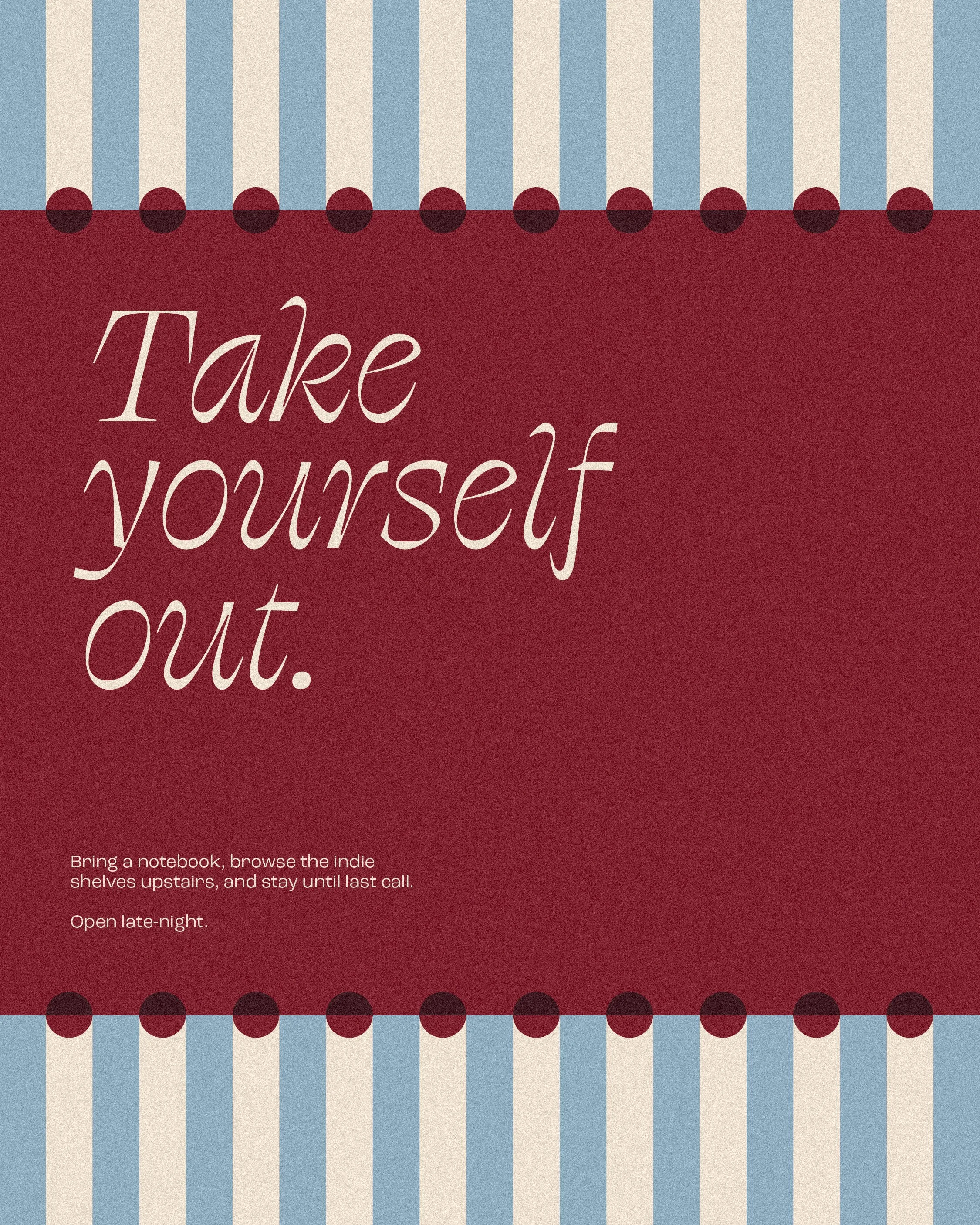
Social assets weave the brand’s elements and day-to-night rhythm into a cohesive digital presence. Designed to feel like an upscale editorial extension of the physical space.